
Technical access and useful content
Keep the answer and its evidence usable on mobile.
Mobile content parity means preserving the main answer, its conditions, supporting evidence and necessary actions across desktop and mobile experiences. The layout can change. The reader must still be able to understand the decision and reach the same useful next step.
Free learning from Semantec SEO.

Define the content that must survive.
List what the page needs to accomplish before comparing screenshots. Include the direct answer, definitions, criteria, numbers with units, exceptions, sources, meaningful images and routes. For a decision table, the row labels and the limitations can be as necessary as the headline result.
Google uses the mobile version’s content for indexing and recommends equivalent main content across mobile and desktop. Responsive presentation can differ, but removing part of the explanation changes what is available. A desktop screenshot does not establish that the narrow experience preserves the same meaning.
Compare both visible content and the document structure. Material may exist in the HTML while CSS clips it, places it behind another layer or hides it from everyone at a narrow width. Content inside an accessible disclosure can remain available without being permanently expanded.
Record the test URL, page version, viewport, browser, zoom, access state and data state. Compare the same content version rather than a cached desktop page against a newer mobile page. Treat a missing observation as unknown rather than a pass.
Compare links, metadata and structured markup.
Follow contextual links and navigation on the narrow page, including links inside tables and expanded content. Check that source citations, definitions and return routes remain reachable and that their labels still make sense after the layout changes. A menu route cannot replace a citation that disappeared from a row.
Inspect the title, description, robots instructions and canonical preference for both presentations. For separate mobile URLs, check the correct corresponding page rather than a generic mobile homepage. An unintended indexing restriction on one presentation is a technical defect, not a design adaptation.
Compare applicable structured data with the visible entities and content. Correct URL references and equivalent supported facts should survive. Copying markup that describes desktop content removed from mobile creates a mismatch; merely preserving JSON syntax does not solve it.
Compare image meaning and alternatives, too. Responsive file selection may reduce transfer size while preserving the relevant subject and detail. Cropping away a label, exception or necessary step can change the explanation even when the image loads successfully.
Test interaction and reading order.

Test keyboard focus, touch activation, labels and reading order. Reordering visual columns can leave the document sequence confusing. A source note should not move after an action if the note contains a condition needed before that action.
Check disclosures for an understandable label, operable controls and readable expanded content. Distinguish content already present and revealed by a control from content fetched only after user interaction. Google advises against relying on interaction to load main content for crawling.
Review the narrow layout and text enlargement. WCAG 2.2 includes reflow, text resize, meaningful relationships and keyboard requirements. Two dimensional data tables can need horizontal movement; this does not justify horizontal scrolling for the entire surrounding article.
Observe clipping, focus visibility, overlays and target access in the rendered page. A screenshot can show a missing column but cannot establish that keyboard or assistive technology operation works. Keep the evidence for each check separate.
Worked example: repair disappearing table columns.
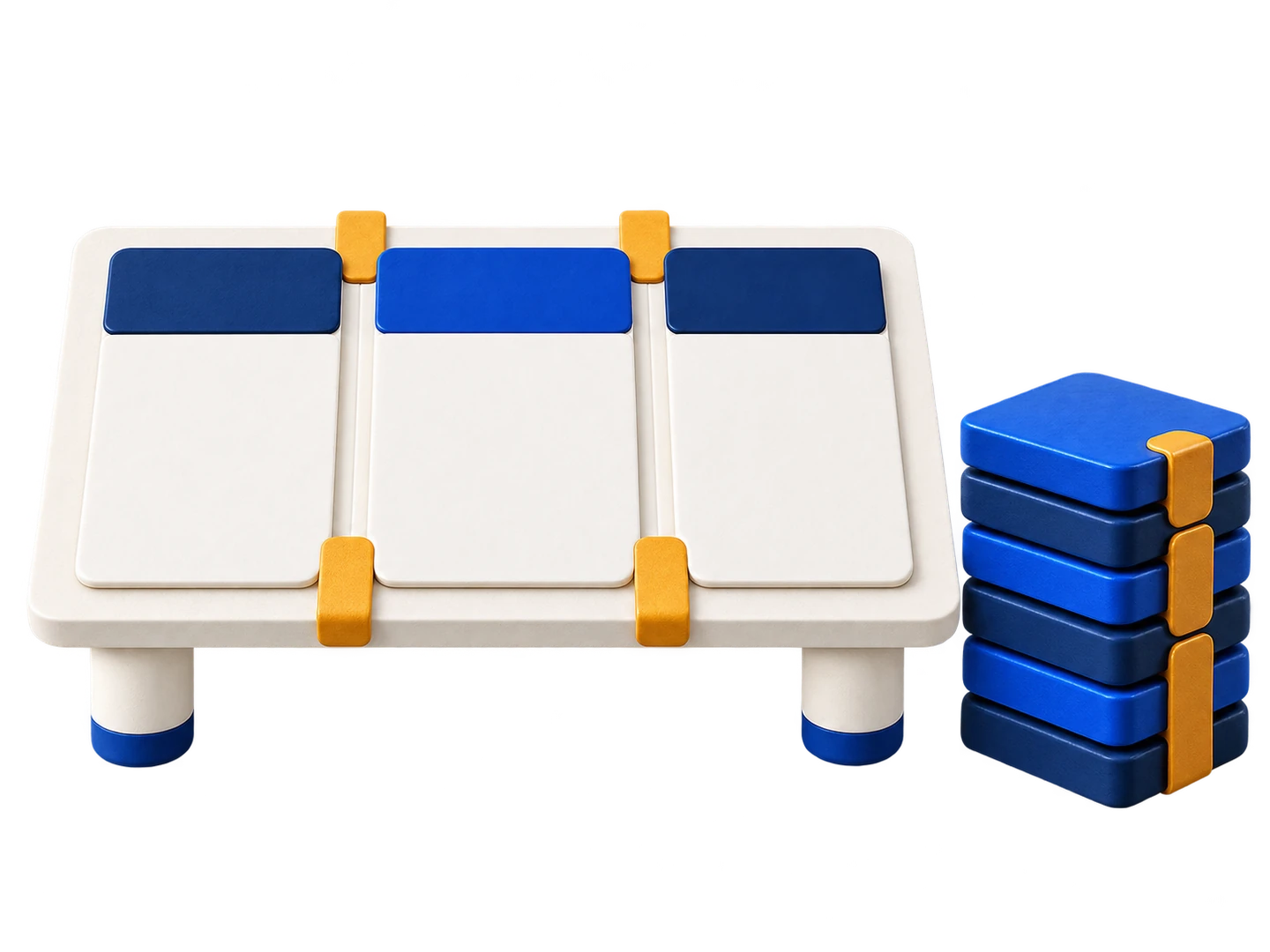
The example is fictional. A desktop comparison has four columns: option, suitability, evidence and limitation. Option A supports the recorded task only with an approved adapter; option B supports it directly but has an untested edge case. Each row has its own source record.
The mobile stylesheet hides evidence and limitation to fit the screen. Readers now see two apparently suitable options without the conditions that control the choice. This is a failed parity check even if the visible two column table looks tidy.
Repair option one keeps the complete table in a clearly indicated horizontal scroll container while the rest of the page reflows. Preserve headers, source links and all row relationships. Repair option two stacks each row as a labelled record containing all four fields. Choose after checking how readers compare the options; do not assume either pattern is universally superior.
The static example table below retains the full decision. In a deployed repair, test a narrow viewport, enlarged text, keyboard access, link activation and the final reading order. Do not mark it accepted solely because the developer removed the display:none rule. The source and limitation must be perceivable and usable in the chosen component.
| Option | Suitability | Evidence | Limitation |
|---|---|---|---|
| A | Suitable only with the approved adapter | Example source record A, reviewed for this configuration | Adapter approval required before selection |
| B | Suitable for the recorded standard task | Example source record B, standard configuration | Edge case not tested; do not infer support |
Record a parity decision and its limits.
For each necessary unit, retain its desktop state, mobile state, evidence, failure, repair, responsible owner and verification result. Record what must remain, how each presentation behaves, what changes and what observation accepts the repair.
Retest when the template, content, media, disclosure behavior or source table changes. Include loading and error states if they affect the answer. A failed image or delayed data response can reveal a content dependency that the normal screenshot conceals.
Passing a content comparison does not establish complete accessibility, search indexing or conversion success. It establishes the specific observations recorded. Any untested interaction or device condition remains open rather than being hidden inside a general mobile friendly label.
Sources and further reading.
The linked documents explain platform behavior and accessibility requirements. The examples and decision records here are editorial teaching material, not observations from a live audit.
Continue learning
Choose the next related task.
Use the technical access and indexing hub. Return to the semantic SEO learning overview to choose another subject.