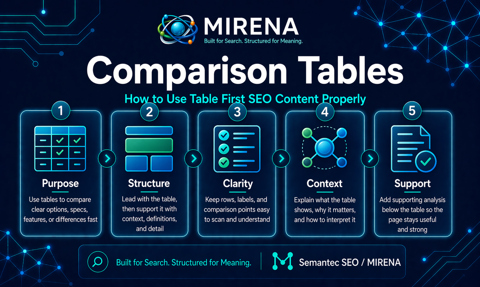
A comparison table is a structured way to place two or more options side by side so a reader can see the differences quickly.
That is why comparison tables work in SEO.
They help search engines and readers process contrast faster:
- feature vs feature
- option vs option
- method vs method
- old approach vs better approach
A good comparison table reduces friction.
A weak one adds clutter.
So the goal is not to throw a table into a page because “tables rank.”
The goal is to use a table when the query naturally asks for side by side evaluation.
Why comparison tables work
Comparison tables work well because they match how many real searches are phrased.
Some users want:
- the difference between two things
- the best fit for a certain situation
- a fast side by side summary
- a simpler decision before they read the rest of the page
That is why comparison tables often fit comparative and commercial investigation queries better than long paragraphs.
A paragraph can explain.
A table can clarify.
This also fits the wider MIRENA approach: classify the intent first, then choose the format the query deserves. For the broader structure behind that, see intent led brief, SERP feature briefing, and intent based formatting.
What a good comparison table does
A good comparison table helps the reader answer one clear question.
Examples:
- What is the difference between featured snippets and People Also Ask?
- Which workflow is better for this use case?
- Which option is better for agencies, and which is better for in-house teams?
- What changes when you move from a raw process to a processed one?
That means a good table needs:
- a clear comparison subject
- rows that weight highest [EAV]
- labels people can understand fast
- supporting explanation underneath
The table is the summary layer.
The paragraphs around it are the interpretation layer.
You need both.
When comparison tables make sense
Comparison tables work best when the query has obvious contrast built into it.
Examples:
- X vs Y
- difference between X and Y
- best option for X
- compare X and Y
- tool A vs tool B
- raw vs processed
- brief vs draft
- snippet vs PAA
This is why they often appear in:
- comparison pages
- feature pages
- product pages
- definition pages with contrast sections
- decision stage content
They are less useful when the topic is purely explanatory and not really comparative.
If the page is trying to answer a “what is” query with no real contrast, a definition block may be stronger than a table. For that side of the cluster, see featured snippets and People Also Ask.
What kinds of queries deserve a comparison table
A comparison table fits best when the user needs one of these:
1. Side by side differences
This is the clearest use case.
Example:
- Featured snippets vs People Also Ask
- FAQ schema vs FAQ content
- Entity led brief vs generic content brief
2. Decision support
The reader is choosing between approaches, tools, or workflows.
Example:
- MIRENA vs ChatGPT
- Processed topical map vs loose topic clustering
- Rewrite existing content vs draft from scratch
3. Condensed evaluation
The topic is too messy in paragraph form, but easy to scan in rows.
Example rows:
- best for
- format
- intent fit
- output quality
- structure depth
- internal linking support
4. Before and after clarity
A table can show what changes when a page, process, or workflow is improved.
That is often useful for rewrite pages and audit pages.
See before and after structure example and how to audit a draft.
How to structure a comparison table properly
A strong comparison table is simple.
Here is the basic shape:
| Criteria | Option A | Option B |
|---|---|---|
| Best for | Clear use case | Clear use case |
| Format | Short description | Short description |
| Strength | Main advantage | Main advantage |
| Limitation | Main limitation | Main limitation |
| When to choose it | Practical decision point | Practical decision point |
That is enough for most pages.
The mistake is trying to make the table do everything.
A table should help the reader orient fast.
It should not replace the rest of the page.
The best rows to include in a comparison table
The right rows depend on the query, but these are often useful:
- definition
- best for
- primary strength
- limitation
- ideal use case
- output type
- setup effort
- format fit
- intent fit
- scale
- speed
- structure depth
What weighs is relevance.
If a row does not help the decision, leave it out.
How to optimize comparison tables for SEO
1. Match the table to real intent
Do not add a table just because you want one.
A table should appear because the page is answering a comparison query or because one section of the page needs side by side contrast.
That is the first filter.
If the topic is comparative, a table often belongs near the top.
If the topic is mainly explanatory, the table may belong lower down as a supporting section.
2. Put the table near the decision point
Placement weights.
If the whole page is a comparison page, the table can appear early, often after a short answer block.
If the table is supporting a broader article, place it where the reader naturally needs the contrast.
Do not bury it so deep that the comparison loses force.
Do not place it so early that the page has no context.
3. Keep row labels plain
Row labels should be easy to understand on first read.
Weak:
- Functional Value Delta
- Relative Operational Distinction
Better:
- Best for
- Main strength
- Main drawback
- When to use it
Plain language makes the table more useful and easier to scan.
4. Compare meaningful criteria, not filler
A lot of comparison tables fail because the rows are shallow.
Bad rows:
- nice design
- powerful
- flexible
- modern
Those do not mean much.
Better rows:
- best for
- ideal team size
- content planning support
- internal linking support
- SERP feature support
- rewrite support
- schema readiness
The rows should reflect real differences.
5. Add interpretation below the table
A table helps readers scan. It does not always help them decide.
After the table, add a short section that explains:
- who should choose which option
- where the table may oversimplify things
- which trade offs weigh most
That keeps the page useful instead of thin.
6. Support the table with clean surrounding structure
Comparison tables work best when the page around them is also well structured.
That means:
- a clear H1
- a direct introduction
- a table that answers the contrast fast
- deeper sections below for explanation, examples, and edge cases
- a useful next step
This is the same structure first rule MIRENA uses across snippet blocks, Q&A sections, and rewrite workflows.
Where comparison tables fit in a page
There are three common placements that work well.
Table first page
Use this when the whole query is comparative.
Example:
- MIRENA vs ChatGPT
- Raw vs processed topical map
- FAQ block vs People Also Ask
Pattern:
- short intro
- comparison table
- explanation sections
- FAQ
- CTA
Mid page table
Use this when the page is mainly educational, but one section needs contrast.
Example: A page on SERP features may include a table comparing:
- featured snippets
- People Also Ask
- FAQ blocks
Decision summary table near the end
Use this when the reader first needs context, then needs a final summary.
Example: A long guide that ends with a “which option suits which case” table.
Common mistakes with comparison tables
Mistake 1: Using tables when the topic is not truly comparative
Not every page needs a side by side format.
If the comparison is weak, the table feels forced.
Mistake 2: Overloading the table
A table with too many rows, too much text, and too many columns becomes hard to read.
The point is fast clarity, not data dumping.
Mistake 3: Comparing the wrong things
The options need a logical reason to be compared.
If the entities are only loosely related, the table confuses more than it helps.
Mistake 4: Leaving the table unexplained
Readers often still need help interpreting what the differences mean.
The table should not sit alone with no guidance around it.
Mistake 5: Hiding the key differences in vague labels
If the rows are generic, the table says very little.
Strong labels produce stronger contrast.
Mistake 6: Forgetting internal links
Comparison pages and comparison sections often sit in the middle of a wider workflow.
They should connect to:
- briefing pages
- rewrite pages
- use case pages
- product pages when relevant
For linking strategy, see semantic internal linking and anchor text by intent.
Comparison tables vs paragraphs
Both formats have a job.
| Format | Best use | Main strength |
|---|---|---|
| Paragraph | Explanation | Adds nuance and context |
| List | Steps or grouped points | Fast scanning |
| Q&A | Follow up questions | Clear retrieval for specific questions |
| Comparison table | Side by side evaluation | Fast contrast and decision support |
This is why formatting should follow intent, not habit.
See intent based formatting for the wider logic.
Comparison tables in commercial and product pages
Comparison tables are especially useful on:
- compare pages
- pricing pages
- use case pages
- product vs alternative pages
That is because buyers often need a fast way to understand differences before they read deeper.
For Semantec, pages like MIRENA vs ChatGPT, where a table first layout makes the contrast clear early.
The important part is honesty.
A good comparison table should clarify the trade offs, not pretend there are none.
How MIRENA approaches comparison tables
MIRENA treats comparison tables as a format choice tied to query intent.
That means:
- the query is classified first
- the page structure is mapped before drafting
- the table is used when side by side evaluation is the clearest answer format
- the rows are chosen around meaningful attributes
- supporting sections explain the differences after the table
- internal links connect the page into the right cluster and next step lane
So the goal is not just “add a table.”
The goal is to build a page where the table does the fast comparison work and the rest of the page does the deeper explanation work.
That is the difference between table decoration and table led structure.
Learn more on MIRENA or go straight to the Drafting + Rewriting use case.
A simple comparison table workflow
Use this when building a comparison section or a comparison page:
- Define the exact contrast the page needs to answer.
- Decide when the table belongs near the top, middle, or end.
- Choose only the rows that help the decision.
- Keep labels plain and short.
- Make the differences visible at a glance.
- Add interpretation below the table.
- Link the page to the right supporting and next step pages.
Quick comparison table checklist
Use this before publishing:
- Is the query genuinely comparative?
- Does the table answer the contrast quickly?
- Are the row labels plain and useful?
- Are the compared criteria meaningful?
- Is the table easy to scan?
- Does the page explain the table after it appears?
- Are internal links guiding the reader to the right next step?
If not, the page probably needs structural editing, not just table cleanup.
FAQ
What is a comparison table in SEO?
A comparison table is a side by side content format used to help readers and search engines understand the differences between two or more options quickly.
When should you use a comparison table?
Use one when the query is comparative, decision led, or needs side by side evaluation to make the answer clearer.
Are comparison tables good for SEO?
They can be, when they match intent and are supported by useful explanation. A table on its own is not enough.
Should a comparison table replace the rest of the page?
No. It should speed up understanding, then the rest of the page should add explanation, nuance, and context.
What makes a comparison table useful?
Clear labels, relevant criteria, easy scanning, honest differences, and supporting interpretation underneath.
Final take
Comparison tables work because they reduce the work a reader has to do.
They are useful when the query asks for contrast, choice, or fast evaluation. They are weak when they are forced into pages that do not really need them.
The best comparison tables do not try to carry the whole page.
They do one job well: make the difference obvious.
Then the rest of the page explains what that difference means.
If you want help building comparison led pages inside a cleaner workflow, start with SERP feature briefing, continue with rewrite existing content, and see how the full system works in MIRENA.