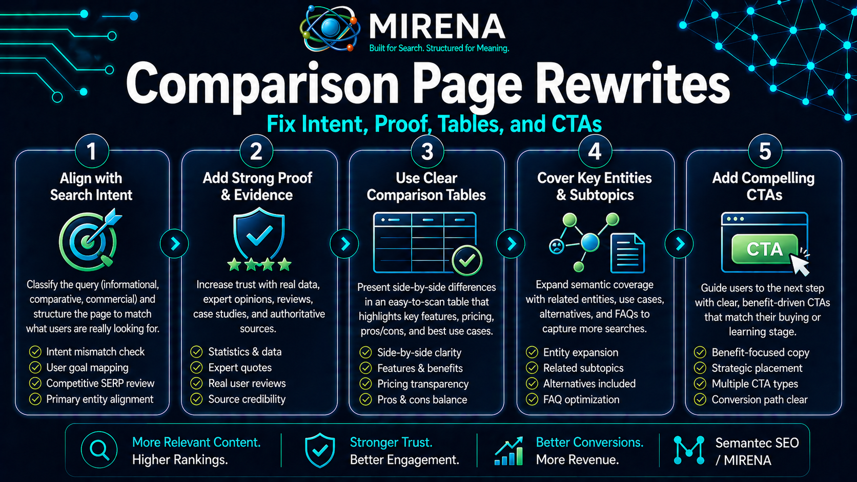
Comparison page rewrites fix pages that should help readers choose between two options, but instead feel thin, biased, vague, or hard to trust.
A weak comparison page often repeats feature lists, adds a shallow pros and cons table, and ends with a forced call to action. That kind of page may target a useful query, but it does not help the reader make a confident choice.
A strong comparison page rewrite changes the job of the page. It clarifies the search intent, defines the decision criteria, compares the right attributes, adds proof, answers objections, and routes the reader to the next step.
This page belongs inside the Drafting and Rewriting workflow. If the page has the wrong search angle, start with Rewrite for Search Intent. If the page needs a clearer route from answer to action, pair this with Rewrite for Conversion Paths. If the page overlaps with another URL, read Fixing Overlapping Pages before rewriting.
What is a comparison page rewrite?
A comparison page rewrite is the process of improving a page that compares two or more products, tools, methods, services, or workflows.
The rewrite should help the reader answer one question:
Which option fits my situation best?
That means the page needs more than surface level contrast. It needs clear criteria.
A strong comparison page may compare:
- features
- workflow fit
- cost
- setup time
- audience fit
- use cases
- limits
- learning curve
- output quality
- support needs
- proof signals
- next step options
The goal is not to make one option look good at any cost. The goal is to help the reader make a better decision.
Why comparison pages often fail
Comparison pages fail when they are written like sales pages in disguise.
Common problems include:
- one sided claims
- weak criteria
- shallow feature tables
- no clear audience fit
- missing drawbacks
- vague proof
- no use case framing
- copied vendor language
- bloated intros
- buried answer
- weak internal links
- no clear next step
A comparison page should not feel like a pitch pasted into a table. It should feel like a decision page.
If the page is part of a wider product comparison cluster, connect it back to the main Compare hub so readers can keep moving through the decision path.
Start with the query behind the comparison
Every comparison query has a hidden job.
A search for “MIRENA vs ChatGPT” is not only asking for a list of differences. The reader wants to know which workflow fits the task. A search for “SEO tool vs AI writer” may be asking which one helps with structure, not just output.
Before rewriting, name the job behind the query.
Ask:
- Is the reader choosing a product?
- Is the reader comparing a method?
- Is the reader checking if one tool can replace another?
- Is the reader trying to save time?
- Is the reader worried about quality?
- Is the reader close to buying?
That answer shapes the page.
For example, a page like MIRENA vs ChatGPT should not only compare AI tools. It should explain the difference between open ended prompting and a structured SEO workflow.
Rewrite the intro around the decision
A weak comparison intro says the two options are popular and then delays the answer.
A stronger intro gives the reader a clear decision frame fast.
Use this pattern:
- Name the two options.
- State the core difference.
- Tell the reader who each option fits.
- Point to the table or decision path.
For a comparison rewrite, the opening should not hide the useful answer.
Example:
“MIRENA and ChatGPT can both help with SEO work, but they are built for different jobs. ChatGPT is flexible for open ended tasks. MIRENA is built around structured SEO workflows for planning, briefing, drafting, rewriting, internal links, and schema ready output.”
That kind of intro gives the reader context before the details.
Build the comparison around criteria
The table should not be a random list of features.
It should compare the factors that shape the decision.
A better comparison table uses criteria like this:
| Criteria | Option A | Option B | Best fit |
|---|---|---|---|
| Primary job | What it is built to do | What it is built to do | Who should choose each |
| Setup effort | How much work it takes | How much work it takes | Fast setup vs custom setup |
| Workflow depth | How structured the process is | How structured the process is | Simple tasks vs repeatable operations |
| SEO structure | How well it handles entities, intent, links, and format | Same | Structure led teams |
| Proof needs | What evidence supports the claim | Same | Risk sensitive buyers |
| Next step | Where the reader should go | Same | Use case, product, or pricing |
A table like this helps the reader think. A feature dump only fills space.
Add use case fit
Comparison pages get stronger when they stop pretending every reader has the same need.
A good rewrite should include a “best for” block.
For example:
| Reader need | Better fit |
|---|---|
| Open ended brainstorming | Flexible AI assistant |
| SEO page planning | Structured SEO workflow |
| Content brief production | Entity led brief workflow |
| Existing page cleanup | Rewrite workflow |
| Internal link planning | Site structure workflow |
| Product review before buying | Compare page plus pricing page |
That is why pages in the comparison cluster should link into relevant use cases. A reader on a rewrite focused comparison should have a clear route to MIRENA for Drafting and Rewriting. A reader still learning the product should go to MIRENA.
Give both sides a fair reading
A comparison page loses trust when it makes one option sound useless.
A rewrite should name where each option wins.
For example:
- One tool may be better for fast general tasks.
- Another may be better for repeatable SEO production.
- One may suit solo exploration.
- Another may suit structured team workflows.
- One may be low friction.
- Another may give clearer outputs for a defined SEO process.
This does not weaken the page. It makes the final recommendation more credible.
Fix vague pros and cons
Pros and cons are useful only when they are specific.
Weak:
- Easy to use
- Good features
- Saves time
- Not for everyone
Stronger:
- Best when the user needs a structured brief before drafting
- Useful when internal link targets must be planned before publishing
- Less suited to one off creative tasks with no SEO workflow
- Stronger for teams that need repeatable page production
Specific claims help the reader choose.
Add proof before the CTA
A comparison page should not jump from claims to pricing too fast.
Add proof signals before asking the reader to buy.
Proof can include:
- a before and after example
- a workflow table
- a use case breakdown
- a short example output
- a decision checklist
- a clear explanation of how the product handles the task
For Semantec SEO, a comparison page can link to Processed Topical Map Example or Entity Led Brief Example when the reader needs to see the method in action.
If the page needs a full proof based rewrite, connect it to Rewrite for Conversion Paths so the claim, proof, and next step are placed in the right order.
Place internal links at decision points
Links on a comparison page should support the choice.
Do not save every link for the bottom of the page.
Place links where they help the reader move.
When the page mentions broader rewrite work, link to Rewrite Existing Content.
When the page explains decision intent, link to Rewrite for Search Intent.
When the page explains buyer movement, link to Rewrite for Conversion Paths.
When the page needs a comparison planning step, link to Briefs for Comparison Pages.
When the reader is ready to assess the product, link to MIRENA or Pricing.
Each link should feel like the next natural step.
Rewrite the winner statement
Many comparison pages end with a weak “winner” line.
A better winner statement uses fit, not hype.
Weak:
“Option A is the best choice for everyone.”
Stronger:
“Choose MIRENA if you need a structured SEO workflow for planning, briefing, drafting, rewriting, internal linking, and schema ready page output. Choose a general AI assistant if you need open ended help across many tasks and can manage the SEO process yourself.”
That is clearer and more useful.
Add a decision checklist
A checklist helps readers self select.
Choose MIRENA if you need:
- structured topical planning
- entity led content briefs
- rewrite workflows for existing pages
- support for internal link planning
- SERP format planning
- schema ready structure
- repeatable SEO production
Choose a general AI tool if you need:
- open ended brainstorming
- broad writing support
- ad hoc research prompts
- non SEO tasks
- flexible chat based assistance
This kind of block supports both user experience and conversion.
Comparison page rewrite model
Use this model when rewriting a comparison page.
1. Identify the decision
Name what the reader is trying to choose.
2. Define the criteria
Pick the factors that shape the choice.
3. Rewrite the intro
Give the core difference early.
4. Replace feature dumps with fit based tables
Compare use cases, limits, workflows, and reader needs.
5. Add proof
Show the method, workflow, or example before the CTA.
6. Add internal links
Route readers to the compare hub, related rewrite pages, product page, use case page, and pricing.
7. Close with a fit based recommendation
Tell readers who should choose each option.
Before and after example
| Element | Before rewrite | After rewrite |
|---|---|---|
| Intro | Broad setup | Clear decision frame |
| Table | Random feature list | Criteria based comparison |
| Pros and cons | Generic claims | Specific use case fit |
| Proof | None or weak | Example, workflow, or output support |
| Links | Bottom only | Placed beside decision points |
| CTA | One hard sell | Use case, product, or pricing route |
| Final answer | One sided winner | Fit based recommendation |
A stronger comparison page does not only sell. It helps the reader make a sound choice.
Common mistakes
Comparing features without context
Features only help when readers know why they matter for the decision.
Hiding the answer
Readers came for a comparison. Give the core difference early.
Being too one sided
Trust drops when the page refuses to admit where the other option fits.
Using the same CTA for every reader
Some readers need the Compare hub. Some need MIRENA for Drafting and Rewriting. Some are ready for Pricing.
Ignoring page overlap
If two comparison pages target the same decision, merge or reshape them. Use Fixing Overlapping Pages before the rewrite.
Schema notes for comparison pages
Comparison pages often need clean page structure before markup.
Useful schema planning may include:
- WebPage
- BreadcrumbList
- Article
- FAQPage when FAQ content is present
- SoftwareApplication when a software product is central
- Product only when the product page meets the right requirements
For deeper setup, use Markup for Comparison Pages after the copy and structure are clear.
How MIRENA fits comparison page rewrites
MIRENA helps plan the site, brief the page, then draft or rewrite the page into a structure search engines can understand.
Comparison page rewrites sit inside the rewrite part of that workflow. The page already has a target decision. The task is to make that decision clearer, fairer, more useful, and better connected to the product path.
MIRENA can help shape the comparison by clarifying intent, finding missing criteria, improving tables, placing internal links, and routing readers toward the right next step. For this workflow, start with MIRENA for Drafting and Rewriting.
Final take
Comparison page rewrites are not about making one option sound perfect.
They are about helping the reader choose.
Start with the decision behind the query. Define the criteria. Rewrite the intro. Build a better table. Add fair pros and cons. Support claims with proof. Place links where the reader needs them. Close with a fit based recommendation.
If you want to improve comparison pages inside a structured rewrite workflow, start with MIRENA for Drafting and Rewriting. If you are ready to assess the product, go to MIRENA or Pricing.
FAQ
What is a comparison page rewrite?
A comparison page rewrite improves a page that compares two or more options. The goal is to make the decision clearer through better criteria, tables, proof, internal links, and next steps.
What should a comparison page include?
A strong comparison page should include a clear intro, criteria based table, use case fit, fair pros and cons, proof, FAQ content, and a route to the next step.
Should a comparison page pick a winner?
Yes, but the winner should be based on fit. A good comparison explains who should choose each option.
How do internal links help comparison pages?
Internal links help readers move from comparison to product, pricing, proof, or related decision pages. They also help the page sit inside the wider site structure.
Where should I go next?
Read Briefs for Comparison Pages if you need to plan the page before writing. Read Rewrite for Conversion Paths if the page has weak movement. Go to MIRENA for Drafting and Rewriting if you want the product workflow.