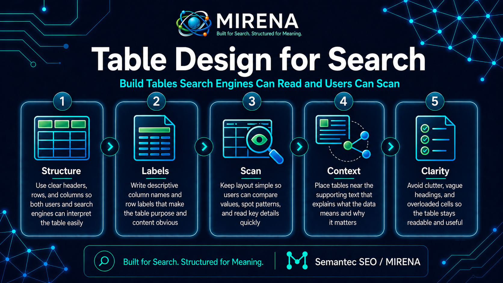
Table design for search is the practice of building tables that are easy for people to scan and easy for search systems to interpret.
A strong table does not just look tidy. It helps the page answer faster, compare faster, and surface the right details in a format that can be picked up more cleanly. If you want the wider cluster first, start with the SERP Features hub. If you are working on comparison focused pages, read Comparison Tables first. If you are still deciding on format, go to Best Format for the Query.
The short version
A search friendly table does four things well:
- It answers a clear query.
- It compares the right fields.
- It uses labels people understand fast.
- It sits in the right place on the page.
A weak table does the opposite. It compares too many things, labels columns vaguely, hides the key decision points, or appears too late to help the page.
Why tables work so well in search
Some queries are built for direct comparison.
People want to scan differences, not read long blocks of copy. They want to see price range, use case fit, limits, strengths, and tradeoffs in one place. A table can do that faster than a paragraph.
That is why tables show up so often on comparison pages, feature pages, software pages, and decision pages. Search systems also like formats that separate attributes cleanly. A table can make those attributes easier to read than a dense paragraph.
If the page is trying to compare options, explain differences, or help a reader choose, a table may be stronger than a long intro. That is the bridge to Intent Based Formatting.
A table is not always the right answer
Not every query needs a table.
A direct definition query may work better with a short paragraph. A process query may work better with steps. A question cluster may work better with short answer blocks and related questions.
Use a table when the page job is comparison, selection, evaluation, or attribute scanning. If the page job is explanation first, the table may support the page without leading it.
That is why format choice should come before design polish. If you have not made the format decision yet, read Best Format for the Query.
What a good search table looks like
A good table is simple enough to scan in seconds.
It has:
- a clear heading above it
- a narrow set of comparison fields
- plain row and column labels
- values that can be understood fast
- one obvious reading path
- no clutter that slows the eye down
Good search tables are built for decision support. They do not try to hold every detail on the page.
What to compare in a table
The strongest tables compare the fields that help a reader decide.
That can include:
- use case fit
- price band
- best for
- strengths
- limits
- setup level
- reporting depth
- support level
- team fit
- content type fit
The fields should match the query and the page role. A table on a software comparison page should not use the same fields as a table on an entity page or an intro page.
Put the table where it helps most
Placement changes the value of the table.
If the query is strongly comparative, the table can appear high on the page after a short opening answer. If the query needs a definition first, the table may belong after the first explanation block. If the table appears too late, it becomes decoration instead of structure.
A good rule is simple: place the table at the point where the reader wants to compare, not after the page has already made them work too hard.
The heading above the table does real work
A lot of weak tables sit under vague headings like “Overview” or “Key Details.”
That wastes a strong signal.
The heading above the table should tell both the reader and the search system what is being compared. It should line up with the query pattern and the section purpose.
Better examples:
- Pricing and use case comparison
- Best fit by team type
- Feature differences by workflow
- Strengths and limits by tool
Weak headings hide the value of the table. Strong headings frame it fast.
Keep the labels plain
Complicated labels slow the reader down.
Plain labels help people scan. They also make the structure easier to read.
Good labels are concrete:
- Best for
- Pricing
- Setup
- Reporting
- Integrations
- Limits
Weak labels are abstract:
- Strategic value
- Platform scope
- Growth alignment
- Workflow maturity
If a label needs explanation, it may not belong in the table.
Choose fewer fields, not more
A crowded table looks complete, but it often performs worse.
The stronger move is to compare the few fields that help the decision. Five useful columns beat twelve noisy ones. The reader should be able to scan the table and know what changes between options.
If you need more depth, keep the core table tight and expand below it with short sections or profiles.
Keep values short and scannable
A table is not the place for long prose.
Values should be short enough to scan without losing meaning. If a cell turns into a mini paragraph, the table starts behaving like broken body copy.
Good values are:
- short
- clear
- comparable
- consistent in length and style
That consistency helps the table feel trustworthy and readable.
Build around comparison logic
A table should help the reader compare the same type of thing across the same fields.
That sounds obvious, but weak tables often mix categories. One row compares tools. Another compares plans. Another compares features. Another compares use cases. The result feels messy.
Keep the comparison unit stable:
- tool versus tool
- plan versus plan
- page type versus page type
- method versus method
If the unit shifts, split the table.
Use the table to support the page answer
The table should not sit alone.
It should connect to the page answer above it and the sections below it. The intro should frame what the table is for. The text after the table should explain the top patterns, tradeoffs, or next step.
That makes the table part of the page structure, not just a block dropped into the middle.
Common table design mistakes
Comparing too many things at once
A table loses power when it tries to compare everything.
Using labels that sound clever but read slowly
Search pages do better with labels people understand at a glance.
Writing long text inside cells
Once cells turn into dense copy, the table stops being easy to scan.
Hiding the table too low on the page
If the query wants comparison, the table should not arrive after a long scene setting intro.
Mixing different comparison units
Keep the row logic stable.
Building the table before the brief is clear
A table built without a clear page job often ends up generic.
Table design is a briefing task first
The table should be planned in the brief, not improvised during drafting.
A good brief should define:
- the table goal
- the comparison unit
- the fields to compare
- the placement on the page
- the heading above it
- the point the table should help the reader reach
That is why SERP Feature Briefing is one of the best next steps from this page.
When a table should lead the page
A table can lead when the query is clearly about choosing, comparing, or scanning options.
Examples include:
- X vs Y pages
- best tools pages
- software comparison pages
- use case comparison pages
- pricing and feature difference pages
In those cases, the page can open with a short framing block and move into the table quickly.
When a table should support the page
A table should support rather than lead when the page needs context first.
Examples include:
- definition pages
- concept pages
- pages where the comparison only makes sense after a short explanation
- pages with mixed intent where comparison is only one part of the answer
In those cases, the table works better after the opening explanation.
Tables and snippet recovery
A page can lose search feature visibility when the table is weak, too broad, poorly placed, or replaced with dense copy.
If a page once had a strong comparison path and then dropped, the repair job is not just about wording. It may be about table design, heading choice, or placement.
If you are reviewing that kind of drop, read Snippet Loss Audit next. If the page needs repair work, move to Rewrite for Featured Snippets.
A simple review checklist
Before publishing a search table, check:
- Does the table fit the query?
- Does it compare one stable unit?
- Are the fields useful for decision making?
- Are the labels plain?
- Are the values short and consistent?
- Is the table placed high enough to help?
- Does the heading explain what is being compared?
- Does the copy after the table explain the pattern, not repeat it?
If the answer is no on several of those checks, the table needs work.
Final take
Table design for search is not about decoration. It is about helping the page answer in a format that is easy to scan, easy to compare, and easier to interpret.
A strong table compares the right fields, uses plain labels, stays tight, and appears where it helps the page most. A weak table tries to do too much, says too little, or arrives too late.
If you are planning the page from scratch, go next to SERP Feature Briefing. If you want the cluster page that sits closest to this topic, read Comparison Tables.
FAQ
What is table design for search?
It is the practice of building tables that support comparison, scanning, and retrieval more cleanly on search focused pages.
Are tables good for every query?
No. Tables work best for comparison, selection, and attribute scanning. Other queries may fit paragraphs, lists, or short answer blocks better.
How many columns should a table have?
Enough to support the decision, but not so many that the table becomes hard to scan. Tighter tables often work better.
Should the table appear at the top of the page?
Only if the query needs comparison early. If the page needs a short explanation first, place the table after that opening block.
What should I read after this page?
Start with Comparison Tables, Best Format for the Query, and SERP Feature Briefing.