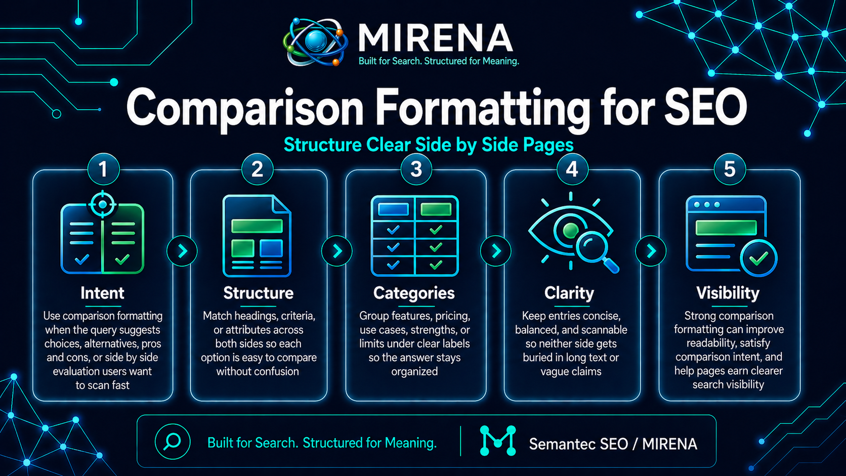
Comparison formatting is the way you structure a page so readers and search systems can scan two or more options fast, understand the key differences, and reach a decision without digging through loose paragraphs.
That is why this page sits in the SERP Features cluster. Comparative queries call for a different layout from definition pages or process pages. In the MIRENA workflow, comparative intent maps to a comparison table or list plus a summary verdict, and snippet candidates are placed near the top in a tight format.
The short version
A strong comparison page does four jobs early:
- names the items being compared
- shows the criteria
- makes the differences easy to scan
- helps the reader choose
If the page hides those four jobs under long intros, it wastes the strongest part of the query.
Why comparison formatting works for search
Comparison queries have a built in task. The reader is not only looking for information. The reader is trying to decide.
That changes the page shape. The answer cannot sit in one broad paragraph. It needs a clear setup, a visible side by side view, and a short verdict that tells the reader who each option fits.
This is also why Comparison Tables and Intent Based Formatting belong next to this page. Search systems look for structures that match the task behind the query, and comparison pages work best when the structure reflects the decision the reader is trying to make.
What comparison formatting looks like
Comparison formatting is not just putting two names in a headline and adding a table somewhere lower on the page.
A good comparison page tends to include:
- a direct opening answer
- a short criteria frame
- a table with clear column headers
- one or more focused breakouts for fit, limits, and use case
- a final verdict or recommendation block
- FAQ support for edge cases and objections
That structure gives the page more than one way to serve the query. It can satisfy the fast scanner, the detailed reader, and the snippet system at the same time.
Start with a direct answer
The opening needs to tell the reader what the page compares and what the main split looks like.
For example:
Tool A is a better fit for teams that want deeper reporting and broader workflow control. Tool B is a better fit for teams that want faster setup and a simpler day to day experience.
That opening works because it does not wait three paragraphs to say what the page is about.
MIRENA’s SERP rules push snippet style answers near the top, keep answers compact, and treat tables as a valid comparison format when they use clear headers.
Put the criteria near the top
A comparison page gets stronger when the criteria are clear before the long analysis starts.
Readers want to know what the page is judging. Good criteria often include:
- price
- setup
- reporting
- workflow depth
- integrations
- team fit
- support
- limits
Do not make the reader guess what counts as a difference.
Use a table early, not late
For most comparison pages, the table should appear near the top of the page, right after the opening answer or short criteria setup.
That works for two reasons.
First, the table gives the reader a fast scan path. Second, it gives search systems a clearer comparison block to pull from.
The MIRENA SERP modules treat comparison tables as a strong response format for comparative queries, and snippet checks look for tables with column headers as comparison ready structures.
A simple comparison table pattern
| Criteria | Option A | Option B |
|---|---|---|
| Best fit | Larger teams | Smaller teams |
| Setup speed | Slower | Faster |
| Reporting depth | Deeper | Lighter |
| Workflow control | Stronger | Simpler |
| Price shape | Higher | Lower |
This works because each row answers one decision point. The table does not try to carry the whole page. It gives the reader a fast scan, then the page can expand into detail.
What to write after the table
The best block after the table is not a long recap of the same rows.
A better move is to break the page into decision blocks such as:
Choose Option A if
- you need deeper control
- you have a more complex workflow
- reporting depth is a top priority
Choose Option B if
- you want faster setup
- your team is small
- simplicity is more important than advanced control
This helps readers move from comparison to choice.
Comparison formatting is about differences, not summaries
A weak comparison page often turns into two mini reviews stacked beside each other. That is not a comparison. That is two summaries.
Comparison formatting needs to keep bringing the page back to differences:
- where one option fits better
- where one option falls short
- what changes the decision
- who each option is for
- what the trade off looks like
If those differences are buried, the page feels slow even if the copy is strong.
The role of verdict blocks
A verdict block is one of the cleanest ways to finish a comparison page.
It does not need to be dramatic. It just needs to answer the next question:
Which one should this reader pick?
A strong verdict block often says:
- pick A for depth
- pick B for speed
- pick A for large teams
- pick B for lean teams
- pick neither if the use case points elsewhere
For brief planning, this is where SERP Feature Briefing becomes useful. Comparative pages work better when the intro answer, the table, the verdict, and the FAQ are decided before drafting starts.
What good comparison formatting is not
It is not:
- a broad intro with no visible verdict
- a long feature dump from vendor pages
- a table with vague row labels
- two separate reviews stitched together
- a page that avoids a recommendation
- a “pros and cons” list with no criteria frame
Readers come to comparison pages to reduce uncertainty. The page should help them move.
Comparison formatting and snippet pull
Search systems can pull more than one style of answer from a comparison page.
A page can surface:
- a paragraph answer near the top
- a table for scan based comparison
- a FAQ block for follow up questions
That is why this page should connect to Featured Snippets, Table Snippets, and FAQ Blocks. The page is not trying to win with one format only. It is trying to match the query with the right mix of visible blocks.
Comparison page flow that works
Here is a clean structure you can use:
- direct answer
- criteria frame
- comparison table
- fit by audience or use case
- strengths and limits
- verdict
- FAQ
That sequence works because it moves from quick scan to deeper decision support.
A weak vs strong opening
Weak opening
Many teams compare tools to decide which platform fits their business goals and future plans.
Strong opening
Platform A is a better fit for teams that need deeper reporting and broader workflow control. Platform B is a better fit for teams that want faster setup and a simpler day to day workflow.
The second opening gives the reader a clear split right away.
Best criteria for comparison pages
The criteria should match the query. Do not reuse the same row set on every page.
Good criteria often come from:
- price and pricing shape
- setup time
- reporting depth
- workflow control
- integrations
- support
- learning curve
- best fit by team type
- best fit by use case
This is where comparison pages beat shallow summaries. A good comparison does not just list features. It picks the criteria that help the reader choose.
Common mistakes
Starting too broad
If the page spends too long talking about the market instead of the difference between the items, the page loses pace.
Hiding the table
A comparison table buried deep in the page loses much of its value.
Using weak row labels
Rows like “features” or “benefits” are too loose. Tighter labels create better scan value.
Refusing to take a position
A comparison page without a verdict leaves the hard part to the reader.
Repeating the table in prose
After the table, expand the decision. Do not just rewrite the same rows.
Comparison formatting and rewrite work
A lot of old comparison pages fail for one of three reasons:
- the answer comes too late
- the table is weak or missing
- the page never reaches a clear verdict
That is where Rewrite for Featured Snippets and Rewrite for Search Intent fit. The goal is not to add more copy. The goal is to reshape the page around the decision path.
Comparison formatting and schema
The visible layout does one job. Schema does another.
Comparison formatting helps the reader and supports extraction from visible content blocks. Schema supports the structured layer around the page. For that side, move next to Schema for SEO, JSON LD Basics, and Product Schema for SaaS.
A simple template
You can use this pattern for the top half of a comparison page:
Opening answer
[Option A] is better for [fit]. [Option B] is better for [fit].
Criteria line
Compare them on [criteria 1], [criteria 2], [criteria 3], and [criteria 4].
Table
Add a table with one row per decision point.
Verdict
Close with a short recommendation by team type, use case, or budget.
Final take
Comparison formatting is about making differences easy to scan and decisions easier to make.
That means a direct answer near the top, clear criteria, a useful table, and a verdict that helps the reader choose. When those parts are in place, the page is stronger for readers and more ready for snippet style extraction.
If you want to build this into the page before writing starts, go to https://semantecseo.com/content-briefs/serp-feature-briefing/. If you want to fix weak live pages, move next to https://semantecseo.com/drafting-rewriting/rewrite-for-search-intent/. For the wider cluster, return to https://semantecseo.com/serp-features/.
FAQ
What is comparison formatting in SEO?
Comparison formatting is the way a page structures side by side evaluation so readers can scan differences fast and reach a decision with less friction.
Where should the comparison table go?
For most pages, place it near the top, after the direct answer and short criteria frame.
Should every comparison page include a verdict?
Yes. A comparison page should help the reader choose, not only list differences.
What comes after the table?
Use fit blocks, strengths and limits, a verdict, and a short FAQ to support the next questions.